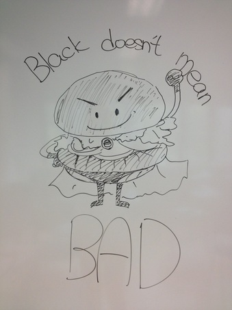
In my opinion, the poster of group five is the most effective poster to promote the Premium Kuro Burger. Why does this burger have to be promoted individually? It’s because of its color. Celebrating the 5th come back anniversary, Burger King promoted the limited edition. The ketchup and the bun are not brown and red anymore. They all become black. That is the selling point of the burger. However, in Hong Kong, black is not a favorable color. It usually links with negative things like triad, criminal organization, evil and hell. If a burger is in black, the image must be symbolized.
The poster of group 5 focuses on this point. Their slogan “Black doesn’t mean BAD” is in large font size. It is even more sight catching than the drawings. Promoting a product, impression is more important than everything. The slogan builds a new image of “black” with simple and concise words. In the poster, it doesn’t mention how and why it is not bad. That’s not lacking of information. It attracts the advertisement consumer to search on their own. Afterwards, the can see more about the ingredient of the burger on the website. The Premium Kuro Burger bun is made of bamboo charcoal, which is black in color. After the consumers find out the truth like this, they understand that the burger is much healthier than the usual ones. They would love the slogan and the poster much more, especially the Hongkongers as they are health conscious nowadays.
As for the cartoon, group 5 used a cartoon bread superman as the advertising character. The superman widens the target consumer to primary kids. With smiley cute face, children are interested in it. A slice of lettuce and tomato was clearly shown in the burger. Parents would feel easy to let the kids to try. The cool color(black) with a smart face of the superman, it may also attract the teen girls’ attention.
The poster is simple in layout but it is not simple. It hides something and lure you to search for some more things.
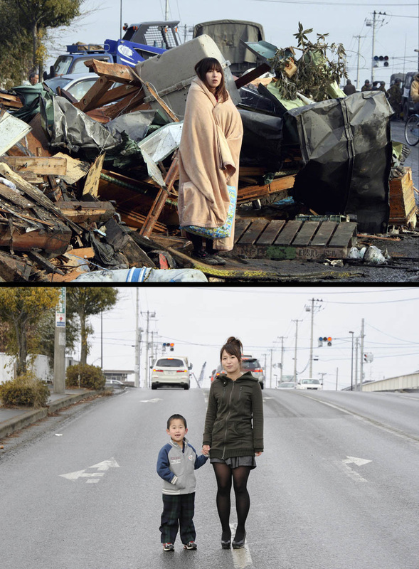
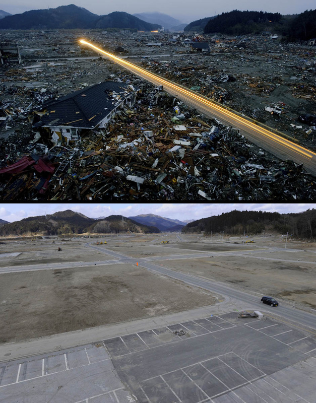
Photo Sources: http://news.nationalpost.com/2012/02/09/see-how-japan-has-rebuilt-in-the-11-months-since-the-earthquake-and-tsunami/ Humans are weak. When facing natural disaster like earthquake and tsunami, all of their lives cannot be controlled by themselves. In this series of photos, it recorded how weak and how strong human beings are. This sentence seems to be a contradiction but it definitely not. The photos recorded the differences between 11 months after the Fukushima earthquake. Railways were ruined. Houses were collapsed. Family members were lost. Debris was everywhere on the street. The situation was really frustrating. However, the Japanese could stay strong and recover. That’s unbelievable. Honestly, I was really moved by this series of photos. In only 11 months, the reconstruction had already been back to a right track. Even though some of the places were still desolate, for some reason because of the impact of radiation, the recovery process ran really fast. If I were the victim, I could not be so tough. Losing home and families, owning nothing but only the debris, what can I do? The photographer chose the same places to take is powerful. There are over twenty couples of photos. Each couple of photos is with just a little bit similar. That a bit similar was used as recognition. Other than that, it showed how strong they are. With smiley faces and flat roads, their eyes showed the confidence and happiness from their bottom of hearts. Being a human being, I am really proud of this.
Photo Source: http://orientaldaily.on.cc/cnt/news/20130223/photo/0223-00176-128p2g3.jpg In Feb, the legislative council was discussing the “International Covenant on Civil and Political Rights” adopted by the United Nations General Assembly. During the discussion, exiting of different opinions is common. Cut and thrust in the assembly is a common practice. However, one of the participants, barrister Lawrence ma was emoted by a councilor Leung Kwok-hung (Longhair). Ma was out of control and used English foul language (You’re not even a fxxking Chinese.) to fight back Longhair’s speech. The photo was taken by Oriental Daily in Feb. In the news, it reported that Ma admitted that the wording he used in the assembly was improper because of anger. Content: Barrister Ma was the main and only object captured in the photo. The background is the assembly hall of the Legislative Council Complex. Composition: Ma was closed up in the photo. It showed that he was the main subject in the whole photo story. His left hand was holding the microphone hard. It emphasized his anger mentioned in the news report. He was frowning when the photo was captured. It meant how dissatisfied he was at the moment. Angle: It was shot from a high point. It was probably from the journalist area. A tele lens was used to capture his face. Because of the venue, the angle was limited by the council. Significance: We find that the picture quality is definitely unacceptable that the resolution is unreasonably low. I do believe that it is because nobody expected to take this shot at the moment. No one thought a barrister would use foul language in the assembly. Thus, I think this photo is a screenshot captured in the video that functions as a record of the assembly. The screen scale broadcasting in Hong Kong is 16:9. But the scale of the photo is about 1:1. It was cropped under a low resolution. The picture quality became such poor. Because of the poor quality, the reporter could show how surprised he was when Ma used such improper wordings.
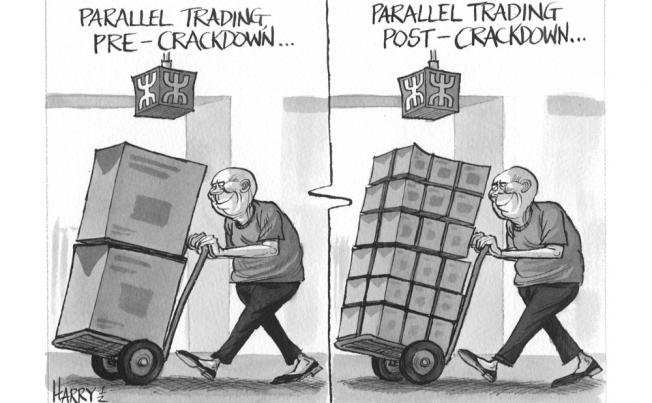
It is a cartoon drawn by Harry Harrison and posted on South China Morning Post on 20Sept 2012. It is about the parallel traders transported the goods in Hong Kong back to the mainland through the MTR Eastrail line. The parallel traders had been active these years in New Territories, especially Sheung Shui and Tai Po. The traders led to a mess in the MTR stations. It affected the passengers using the train services. They carried huge luggage, which occupied a lot of space. Passengers had to delay their journey. Other than making the train crowded, their bulky purchases of milk powder and some daily necessity boosted up the prices of those products in the whole city. Sheung Shui and Tai Po were even worse. RMB appreciated against HKD. Cost of living of Hongkongers had been rising sharply. A great demand for daily necessity from mainland further raised the prices. It harmed the benefits and living standard of the whole society.
In the cartoon, the MTR proposed to lower the limit of the weight of each luggage. However, Harry did not think it is effective. As the cartoon shown, the total amount of the goods did not change. They were only divided into smaller parts. The parallel traders could still transport as much as before back to mainland. What they only had to do is taking the MTR few times more every day. In the cartoon, exaggeration was used. Actually, the original limit set by MTR is much lower( Sum of 3 dimensions of the luggage cannot exceed 170cm). In the cartoon, the luggage was taller than the parallel trader. It was impossible to get into the MTR station. Symbolism was also used. The image of the parallel traders was such negative. They were shorts and ugly. It showed how Hongkongers hated the traders and how dissatisfactory the citizens were.
In my thoughts, beating the parellel trader is just a short term policy. Hong Kong proposes free trade. The beating policy will no longer exist. The problem would appear again afterwards. What the government should do is providing technology and specialists. Only by offering these to mainland China, the food safety in mainland can improve. Only improving the food safety in mainland can help the residence in North New Territories and the new born babies in Hong Kong. I agree the government to eliminate the parallel traders. But it sill has to come up some long term policy. Adopting short term methods only would easily stimulate the dissatisfaction of citizens
Cartoon Source: http://www.scmp.com/sites/default/files/styles/652x403/public/galleries/2012/09/20/cartoon.16.jpg
The most common comic we can see on the newspaper is the peanuts comic. It forms its own style. As for the readers, they can understand the characters’ personality immediately. Moving from peanuts comic to an Italian comic, it creates different version of the same story. Different version provides different angles and moods. Therefore, every single version is unique. Comparing to the base one, I like the Soggettiva version most.
In this new version, the number of pictures remains unchanged as 8. However, it has already told the reader much more about the overall environment of the house that the man and woman live in. As shown on the base version, the first three grids are almost with the same background. Readers can only see how the structure the house is only. On the forth, second last and the last grids, the backgrounds are the same again. Much information is given up because of wasting the spaces to repeat the background.
Why I like the Soggettiva version is it uses a completely different points of sight. The base version uses the third person angle. The whole story is narrative. But in the new version, it adopts the first person angle. More details can be shown. The size and number of grids remain unchanged. At the same time, each grid can tell much more to the readers. Like the first two grid, the angle is from the man’s eyes. It briefly shows the table’s situation. It can also tell the readers what he’s doing on his notebook and how it connects. From eye level to the overlook level, everyone knows he’s standing up. Telling story by not telling but showing, it is much more attractive. Every following grids start from his eyes. They show what the man can see. Readers can devote into the character. It makes the comic more real.
When comparing this edition with the base edition. The story remains unchanged. However, the mood changes a lot. In the base edition, what I can see is a man doing his own daily business only. But for the Soggetiva version, I can see directly what the character can see in every grid. I can fully stand on his view point and thoughts. There is not anything disturbing me to taste the feelings and thoughts of the character.
Photo Source: http://www.fumetti.org/esercizi/4-subjective.gif
|


 RSS Feed