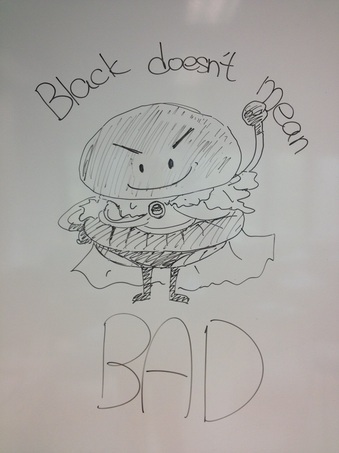
I think Group 5's poster is effective to the children. In that poster, the black burger is created as a burger superman with its superman suit. Giving the burger eyes and mouth makes it become a cute hero cartoon, which may attract children to have a try of the black burgher as it is fun and playful to the children. Hence, with the support of thte children, families may come and eat in Burger King as an event in the family day. Also,the black burger can be not only the product to sell, but also the mascot of this meal or event. Unlike its competer Mcdonald's, Burger King still doesn't have any mascot for its company. I think, this black burger superman cartoon may become its mascot to helpwith the promotion as it can easily give a strong positive and fun image to the children. It can be multi-functional and bring benifits to tyhe company, not only mentioning promoting thte black burger.
And about slogan, "Black doesn't mean bad" has two meanings. One is helping building up the hero image of that cartoon, giving the black colour a meaning of braveness and justice. The other one is indicating the black bun is as delicious as the normal does. So, I think the slogan here is nice and will be successful.
With the limitation of blackboard pens, there's not much colour on the poster. I believe that, if the potser is more colourful, it can increase its effectiveness as it can be more easily to draw people's attention, esepecially the kid's. And with more vivid colours, it makes the black bun stand out and people will focus on it.
In 2012, Brad Pitt had been invited to be the latest spokesmodel of Chanel No5 fragrance, and later on, he acted in the “There you are” commercial and it got lots of teasing and recreations from around the world after it’s released. That’s why it’s popular.
The Advertisement, actually, is very simple. The whole Advertisement is in black and white and the background looks very grey. There is just Brad Pitt himself reading his script and nothing else. Here’s the script: "It's not a journey. Every journey ends but we go on. The world turns and we turn with it. Plans disappear. Dreams take over. But wherever I go, there you are. My luck. My fate. My fortune. Chanel No. 5. Inevitable," Then, it ends with a bottle of Chanel No5 fragrance with the earth as a background in realistic and colorful way. It’s neither produced with the mirror effect nor the window effect, I think, but just promoting its goodwill and credibility.
I think because of the recreations, it became popular. Its setting helps a lot. That means, it’s because it’s so simple, with no gimmick on either the place or the actor. It leaves a lot of possibilities for people to recreate it. It’s just about a man talking in somewhere common. And when we read the script again, actually it’s talking about the legendary history of Chanel No5 fragrance but it was written obscurely. It seems everything can much with the script, not only the Chanel No5 fragrance. For example, the script of “I go to school by bus” recreated by Hong Kong Golden Forum. Everybody can do it in the same way hence recreation can be done s easily. Well known comedians and common people do it.
Another factor which lead to its high popularity is that Brad Pitt is the first male spokesmodel in the history of Chanel No5 fragrance commercial. Everyone predicted there must have something big happening. However, the reality made them so disappointed. In the ad, Brad Pitt is dressed the same as he does in his daily life, or we may say he is acting himself. In our minds, he’s just like a terrible old man soliloquizing. This is very unlike to the ad by Audrey Tautou, the previous spokesmodel of the same fragrance. She acted beautifully, elegantly and romantically with a story behind. The Brad Pitt ad is not a traditional fashion ad and goes to the oppose side of the stereotype of it. This makes it special and popular.
Therefore, recreation , popularity, inevitable.
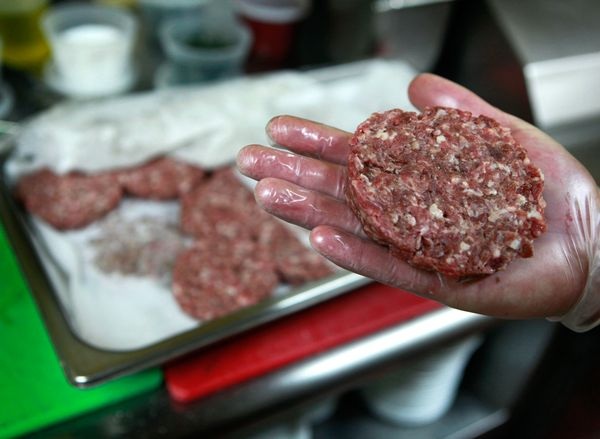
This photo was taken by Matt York at Il Vinaio Restaurant in Mesa, Arizona in 2010 and published on 12 March, 2013, together with a National Geographic News titled “Proposed Lion-Meat Ban Shines Light on Wild-Animal Meat”. This photo was chosen with purpose to match the news content and theme – encouraging the readers to support the ban of lion-meat and not eating exotic animals. In this photo, someone wore gloves and there was a lion- meat patty on his plum. Nearby, there were more lion-meat patties on the big silvery pot on a table. Those lion-meat patties were uncooked and even we can see bloodstains on the gloves. The photo was blurred except his plum and the lion-meat patty he’s holding as the photographer wanted to have readers’ concentration on these two things. When readers focus on these two things, they will easily get disgusted. The reason is that the photographer chose raw meat as his subject and made it as raw as it can. Fat and meat are easily seen in that piece of patty and blood is left on the gloves. It makes a very horror image on lion-meat to tell it’s not a good food to eat and people will easily feel unwell and lose their desire for food when they look at that patty. Therefore, with this effect, people will accept the encouragement given by the news. There is one more reason of making raw meat as his subject. When we see this photo, the first question we ask to ourselves will probably be “Will I eat that?” or “Will I put that raw lion-meat I your mouth?” This is the most direct reaction we make. And the answer “no” comes out just a moment as we eat cooked food. Making food cooked is the essential process before we eat in this era although there are some exceptional cases like Japanese sashimi. Eating something raw, especially raw red meat, makes people feel like a caveman 5000 years ago. Also, it’s lion-meat. Only the primitives will see lion as food source. Here, the photographer made an assumption: if you eat that, you are primitive. Maybe, people will eat the cooked one but this give a very strong first image to the readers. Therefore, again, it helps getting people’s support on the ban. Photo Source: http://images.nationalgeographic.com/wpf/media-live/photos/000/651/cache/lion-meat-patty_65189_600x450.jpg
 SCMP by Harry Harrison 26/9/2012 In the cartoon, there were two researchers discussing the failure of two pandas’ mating. And in front of them, a pair of panda – one is male and one is female, looked at each other angrily. Seemingly, this cartoon is about the failure of copulation between two pandas in Ocean Park – Ying Ying and Lok Lok. However, referring to the dates of that news happened, the two pandas had had copulation twice and the latest one was in March 2012. As this cartoon was released on 26 September 2012 in Harry’s Daily renewed cartoon column, it’s not logical for him to mention such a outdated news. The response of the researcher on the right was the key of this cartoon. “Now we know how Cecil Chao must feel” Cecil Chao is a property developer and a famous billionaire in Hong Kong. His daughter, Gigi Chao, announced her homosexual marriage with her partner Sean Yeung on 22 September 2012. Yet, Gigi couldn’t have the acceptation of her parents. And this should be the focus of this cartoon. The cartoonist used the fail copulation of Ying Ying and Lok Lok as a metaphor to tell the homosexual marriage of Gigi Chao and Sean Yeung. In Chinese concept, being a homosexual is a very big mistake especially after a long time ‘good and normal’ parenting by their Chinese parents and their hardships would be wasted then. The two pandas is a metaphor of Gigi’s sexual orientation and the conversation of the two researchers is a metaphor of thought in Cecil’s perspective. And I think, the cartoonist was joking. Maybe, if the sexes of the two pandas are the same, mating may work. This is just a subordinate paint of the cartoon. Photo source: http://www.scmp.com/sites/default/files/styles/652x403/public/galleries/2012/09/26/cartoon.8.jpg
 This is a quite interesting piece of comic. There are totally 30 small panels and only one particular action is drawn in each of them. I think, those panels are more like movie frames. Some frames are drawn in third person. Some are drawn in first person, and some are close up. This way can make the comic become more alive as the human action is shown more smoothly and more details are given. Readers can easily and quickly catch the idea with the convenience brought by simple ideas in each frames. The comic is drawn in a movie-like style which can enrich the story and make it more funny and interesting. This story was about a man working at midnight with humdrum. To show his humdrum, the cartoonist showed the full process of that he went to the toilet with 4 panels and then 5 panels are used to show that he went back to the toilet and fix after hearing some water dripping. The cartoonist tried to lengthen his action with every detail such as his facial expression, his thought at that moment and every steps of his action. It tells how bored he was at that night and he had lost his concentration, or even himself. “What the hell was I looking for, anyway?” is not only asking for what he was finding in the fridge, but also he was asking the purpose of doing such a boring and time-consuming job, the purpose of being a comic writer. It’s possible that the man in that comic should be actually the cartoonist himself. Photo source: http://www.fumetti.org/esercizi/20-thirty_panels.gif
|
 RSS Feed